

I’m Julie, a product designer saving one digital experience at a time.


Case studies

Booking management app for Viator
Current internal software made it difficult for suppliers to manage bookings and contact customers. As the lead designer, I worked with the user researcher to learn more about their needs and designed an app where they can respond promptly outside their office.

Checkout experience that members love
FabFitFun members get to shop for beauty and wellness products that are 40–70% off retail prices during sales that happen 8 times a year. This exploration looked into the next phase for the checkout experience that members have vested interest in, and was tested successfully with members.
Past work
TRIPADVISOR, 2017

Discovering things to do on the go
More travelers are using digital maps in-destination to orient themselves and find things to do, and the team saw an opportunity to surface Viator tours and activities with fewer taps.

Engaging with target users
We asked 6 tourist groups to find an activity using two different apps to determine if tourists preferred seeing a map of individual tours or list of attractions. More people resonated with attraction-based map because this helped them find tours that involved attractions they wanted to check out.


Exploring interactions
Initial design included attraction cards that slide up along with a list of related products. However, the list occupied lots of space on the map with little room for users to pan around and explore. The next version displayed a shelf of product cards on the bottom separated from the attraction card.

Mapping Attractions
This allowed each tour to stand out and encourage users to play with the cards, in addition to having space to navigate on the map and we decided to move forward in this direction.
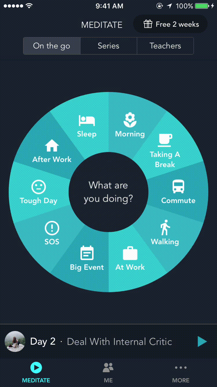
SIMPLE HABIT, 2016

Creating moments of mindfulness
Being present in the moment is becoming difficult with all the digital distractions around us. The founder and I focused on getting people to turn into the app amidst their busy lives and to create a meditation experience that distinguishes Simple Habit from others.
Discovering the right meditation for the situation
One of the challenges was to indicate where they are in series of different topics and to show that they have made progress. To create the simplest meditation experience, the player simply shows a horizontal timeline with dots to indicate which day they're listening to. On-the-go feature makes it easy for people to customize their meditation in just 2 taps.


In the first six months after Simple Habit’s release, people in 115 countries have used it to meditate for a collective total of 20,000 hours. Simple Habit won Google Material Design award for best experience in 2018.


PLASTIQ, 2015

Helping users focus on the task
After registration, this design takes users to making a payment instead of dropping them to an empty dashboard. The update contributed to doubling the percentage of users who make payments after registration.

Paying any bill with credit cards
After a visual design makeover, I produced mobile designs that were consistent with the desktop experience and conducted user testing. The challenge lied in playing with smaller real estate and ensuring that the information that the user provided is visible and clear.
PERSONAL CAPITAL, 2012-2014

Designing — for Android experience
Over 900,000 people use Personal Capital app to track over 4.2 billion dollars by linking their financial accounts - from bank accounts to investment, mortgage, home equity loans, and credit cards.

Perfectly tailored
This design is consistent with the iOS app and adheres to Android UI elements and design patterns for phones and tablets. This included all the screens and features for the app- registration, net worth, spending, investment analysis, settings, widget etc.
“Best personal finance app- By far the best personal finance app on the market.”
RAMY PENA- ANDROID APP USER


Prepping for iOS 7 update
Stripping skeumorphism, iOS 7 elevated content and set up the trend for flat design. As one of the 2 designers there, we did a visual overhaul of the Personal Capital app to create simplified design patterns that allow users to focus on understanding their financial information.

Investment checkup
Based on connected bank accounts and investments, this tool analyzes and offers insights for the user. The design organizes the insights in an interactive manner where the user can take out related cards in each category and talk to the advisor for next steps.

Makeover for Personal Capital’s
marketing site
With a new branding, the challenge was to show and tell the app’s features, and hint the new, savvy lifestyle Personal Capital can offer.


